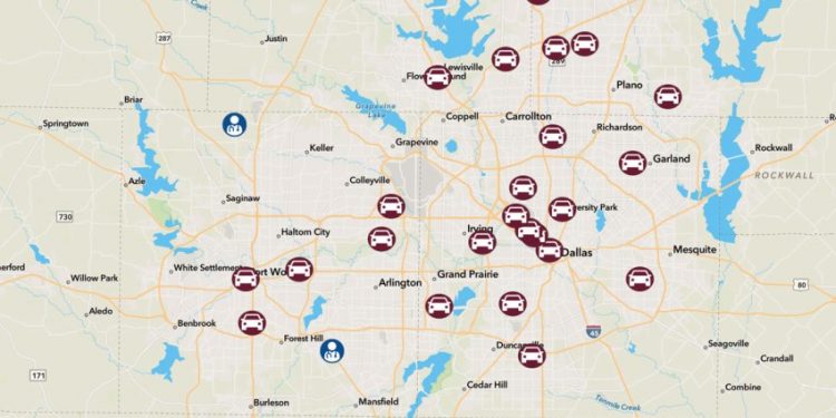
The new layer is color-coded, includes the number of new cases per 100,000 people, and indicates whether the number is increasing or falling.
Google Maps now has a COVID-19 layer that tracks how cases are trending at the county level on the mobile version of the app. You can see how cases are increasing or decreasing in your area as well as the places you visit.
To view the COVID-19 data for a specific location, click the Layers button in the upper right corner and click on the COVID-19 information. You will see a number and it will be “increasing” or “decreasing”.
This number is the average of seven days for the number of new cases per 100,000 people. Layer colors indicate:
Gray: Less than one
Yellow: 1-10 Cases
Orange: 10-20 Cases
Dark Orange: 20-30 Cases
Red: 30-40 cases
Dark red: more than 40 cases
This number includes both confirmed and probable cases at some locations. Potential cases are identified by public health officials and using criteria established by government officials. Some areas may not have data because local authorities have not released data or have not done so recently.
If you zoom out at the state level on the US map, there are increasing or decreasing indicators with one number per state and a matching color code.
In Europe, there is more data for some countries than others. Germany is grayed out, and the COVID-19 map layer displays data for individual states within a country. In France, there is only nationwide data, with a rate of 14.8 cases per 100,000, and it is increasing. Most of Asia is gray.


